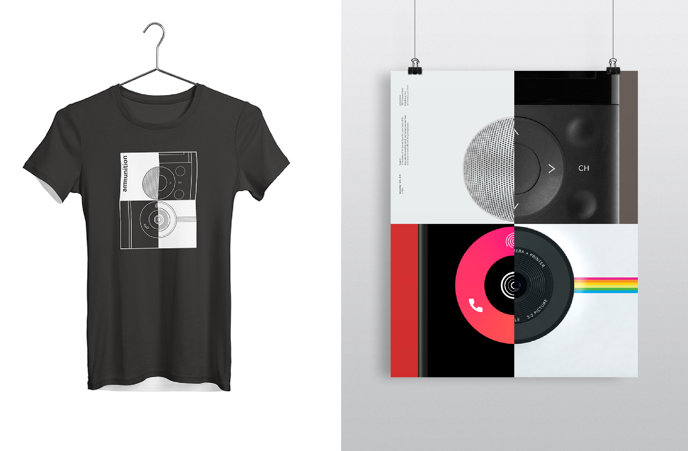
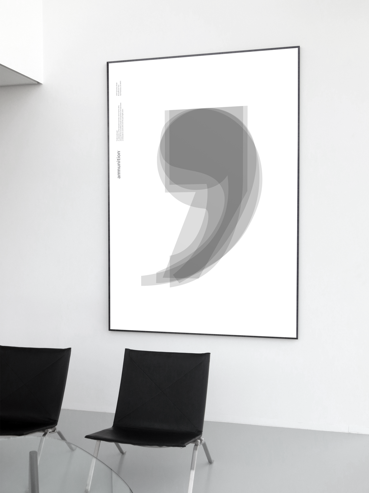
Ammunition Anniversary
As a part of Ammunition Visual Design team, I worked on the ideas for anniversary posters, and my designs were picked two years in a row as the best design for the company’s celebration.
For the 8th anniversary, the design is called Super 8. The inspiration came from photography styling with only one color background, and the four half circles form the shape of an 8. The goal was to showcase the products we created for the past year in a graphical way.
For the 9th anniversary, the design is called To Be Continued. As we can see, comma shares a resemblance with number 9. I overlaped commas from different typefaces to express the company's lasting creativity for the coming years.